| Bio Capacity VI Edition Release Notes |
This index is an ongoing empirical study, updated and refined quarterly. Many of the cities studied are now approaching their data collection limits, which will soon bring us to the next phase of development: identifying and collecting data that measures bio-capacity and anthropogenic footprints in greater depth. This will be an iterative process that requires collaboration and resource allocation from all levels of government, academia, and industry. The goal of this index is to reflect urban anthropogenic footprints with greater detail and accuracy while keeping the index grounded and useful for municipal decision-makers. It provides real visibility into human impacts and identifies areas where solutions can have substantial impacts.
All formulas and equations used are published at the bottom of this article and they are further defined in the downloadable spreadsheets on each city's scoreboard webpage. more...
All formulas and equations used are published at the bottom of this article and they are further defined in the downloadable spreadsheets on each city's scoreboard webpage. more...
Updates In This Edition
No new indicators were added and five indicators were revised. Intermediate data calculations are now shown in the detailed spreadsheets for each city.
No new indicators were added and five indicators were revised. Intermediate data calculations are now shown in the detailed spreadsheets for each city.
- Transportation Usage calculates trip distance percentages for Transit, Bike, Walk, Automobile
- Parkland Area was revised to a percentage of the city area
- Natural Land Area was revised to a percentage of the city area
- Data Freshness is now scored
Index Run Statistics
In this edition, the updates listed above were included. Where possible, links to the data were added to the downloadable spreadsheets.
In this edition, the updates listed above were included. Where possible, links to the data were added to the downloadable spreadsheets.
- 23 data indicators plus 3 statistical indicators
- 1300 data points were scored
- 95.5% data collection rate
- 445 data points were updated since the last release
- 1053 data source web links were published
- 50 score detail spreadsheets with data points, sources, formulae, etc...
- 59 Floor Scores* and 9 Outlier Scores* ( * see below)
Scoring Practices
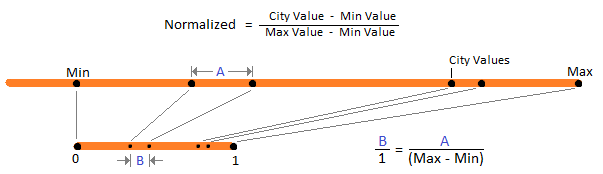
- Normalized Values are comparative values between zero and one which makes them ideal for indicators. Normalized data is also ideal for comparative indicators because they preserve the data separation ratios as shown in the diagram below.
- City Size Categories Cities are split into size categories with their own maximum and minimum values. Splitting cities into size categories is what allows indicator comparisons to be meaningful.
- Floor Scores are the minimum data point collected from all cities within a size category. When a city data point is missing its indicator is assigned zero, but any other indicator that uses the missing data point in its calculation uses the floor score instead; Analysis has proven this to be more accurate when calculating compound indicators.
- Outlier Scores are used when data points are extremely large or small. These are outliers and as such the next highest data point is used to calculate the maximum. Outliers are caused by unusual circumstances that go beyond the current scoring parameters and may warrant further study.
- Missing data points are replaced with a regional default where feasible, otherwise, the indicator score is set to zero. This is always noted in the scoring comments column in the city spreadsheet.
- Indicator weighting is now used for temperature extremes and housing demographics. In future editions, the weighting will be applied to other indicators so as to reflect their anthropogenic impact more accurately.
- Data Freshness is now calculated and scored. The Average Date column in spreadsheet details is formatted as follows: "YYYY.N" where "N" is in tenths of a year. It is used to decide when data points are "stale dated".
| City Indicators |  |
City Size Categories: calculated from City Population
Our research shows that smaller cities have smaller eco-footprints which is an inescapable fact due to scale! Larger cities have mass transit infrastructure which is not typically viable in smaller cities, so classifying cities by population size makes comparative analysis possible and fair to all cities studied.
Our research shows that smaller cities have smaller eco-footprints which is an inescapable fact due to scale! Larger cities have mass transit infrastructure which is not typically viable in smaller cities, so classifying cities by population size makes comparative analysis possible and fair to all cities studied.
Population Impact:
Smaller populations have smaller footprints. They require less space for residential, commercial, industrial, recreation, and other human activities; all of which make footprints smaller. Lower is better
Smaller populations have smaller footprints. They require less space for residential, commercial, industrial, recreation, and other human activities; all of which make footprints smaller. Lower is better
Municipal Area:
Measured in square km. Larger municipal boundaries create larger city footprints. Annexation and amalgamation are how cities grow in size and this is always done for economic reasons. The exceptions to this rule are Halifax and Saguenay; both of these cities have regional boundaries and they have extensive wilderness reserves inside their boundaries which skew Municipal Area, Population Density, and Wilderness Area indicators. For this reason, they are given an outlier score for these indicators. Smaller is better
Measured in square km. Larger municipal boundaries create larger city footprints. Annexation and amalgamation are how cities grow in size and this is always done for economic reasons. The exceptions to this rule are Halifax and Saguenay; both of these cities have regional boundaries and they have extensive wilderness reserves inside their boundaries which skew Municipal Area, Population Density, and Wilderness Area indicators. For this reason, they are given an outlier score for these indicators. Smaller is better
Population Density: calculated from multiple data points
Protected greenspace areas are subtracted from Municipal areas because it reflects a more realistic density calculation. Higher population densities mean less space is used for more human activity; this is a measurement of footprint efficiency thus making higher density scores more desirable. It is also an indirect measurement of urban sprawl which has become the largest cause of greenspace loss inside city limits. Wilderness Reserve areas are also included in this calculation. Higher is better
Protected greenspace areas are subtracted from Municipal areas because it reflects a more realistic density calculation. Higher population densities mean less space is used for more human activity; this is a measurement of footprint efficiency thus making higher density scores more desirable. It is also an indirect measurement of urban sprawl which has become the largest cause of greenspace loss inside city limits. Wilderness Reserve areas are also included in this calculation. Higher is better
Population Growth Pressure:
The percentage of population growth. Slower population growth requires less space to grow into which means smaller footprint growth. City's with negative growth are assigned zero growth because negative growth is currently beyond the scope of this study. Lower is better
The percentage of population growth. Slower population growth requires less space to grow into which means smaller footprint growth. City's with negative growth are assigned zero growth because negative growth is currently beyond the scope of this study. Lower is better
Travel by Walk, Bike, Transit: - Revised
This indicator measures the population's uptake of public transit, cycling, and walking when traveling. It is calculated from Smartphone GPS data by Google Insights for many cities; for the other cities, we use the Magnets III study by the Conference Board of Canada. Our preferred data source is Google's Sustainability Insights data because it measures actual kilometers traveled.
The following weighting factors were used. Higher is better
- Personal Automobile weighting factor is ZERO (Roads, Parking, massive infrastructure)
- Public Transit weighting factor is 1 (Buses, Trains, Subways, concentrated infrastructure)
- Cycling weighting factor is 1 (Bike paths, parking, minor infrastructure)
- Walking weighting factor is 1 (No infrastructure required)
Driving Distance For Solo Commutes:
This indicator scores the median driving distance in kilometers for solo automobile commuters traveling to work. Lower is better.
This indicator scores the median driving distance in kilometers for solo automobile commuters traveling to work. Lower is better.
Workforce Commuting Outside City: - Revised
Measures the ecological impact of the workforce traveling outside the city for employment. This can cause heavy traffic, larger road infrastructure, and poor air quality. Lower is better.
Measures the ecological impact of the workforce traveling outside the city for employment. This can cause heavy traffic, larger road infrastructure, and poor air quality. Lower is better.
Housing Demographics:
This indicator scores residential housing footprints. Until cities start publishing their housing statistics we are using Municipal Census data as a proxy. Each housing type is weighted to approximate the land consumption per dwelling. Detail spreadsheets have a tab that shows this calculation. Lower is better
This indicator scores residential housing footprints. Until cities start publishing their housing statistics we are using Municipal Census data as a proxy. Each housing type is weighted to approximate the land consumption per dwelling. Detail spreadsheets have a tab that shows this calculation. Lower is better
Air Pollution Emissions:
Total Particulate Matter (TPM) in tonnes per year. The substances measured are: Particulate Matter 10 Microns or less, Particulate Matter 2.5 Microns or less, Sulfur Oxides, Nitrogen Oxides, Volatile Organic Compounds, Carbon Monoxide, and Ammonia. Lower is better
Total Particulate Matter (TPM) in tonnes per year. The substances measured are: Particulate Matter 10 Microns or less, Particulate Matter 2.5 Microns or less, Sulfur Oxides, Nitrogen Oxides, Volatile Organic Compounds, Carbon Monoxide, and Ammonia. Lower is better
Solid Waste Tonnage:
The total tonnage of garbage before recycling redirect percentage. Lower is better
The total tonnage of garbage before recycling redirect percentage. Lower is better
Recycling Diversion Rate:
Percentage of waste recycled and redirected away from landfills. Higher is better
Percentage of waste recycled and redirected away from landfills. Higher is better
Organic Waste Tonnage:
Total organic matter tonnage collected by the city from all sources. Higher is better
Total organic matter tonnage collected by the city from all sources. Higher is better
Domestic Water Usage: Lower is better
GHG Emissions: - Revised
Provinces track Greenhouse Gas (GHG) emissions and publish data for the whole province. Cities are now expected to report GHG emissions to provincial and/or federal government agencies and we will use that data as it becomes available. Lower is better
Provinces track Greenhouse Gas (GHG) emissions and publish data for the whole province. Cities are now expected to report GHG emissions to provincial and/or federal government agencies and we will use that data as it becomes available. Lower is better
Clean Electrical Capacity:
This is a percentage calculation. Some cities measure their own capacity but most rely on Provincial statistics. We have included nuclear power generation in this calculation because it does not emit GHGs. Higher is better
This is a percentage calculation. Some cities measure their own capacity but most rely on Provincial statistics. We have included nuclear power generation in this calculation because it does not emit GHGs. Higher is better
Green Initiatives On Website:
We do not score the content and only the existence of a consolidated sustainability landing page with links to recycling, green space initiatives, protection programs, etc. We maintain links to it for all cities in the index. A clear landing page scores 1 otherwise 0
We do not score the content and only the existence of a consolidated sustainability landing page with links to recycling, green space initiatives, protection programs, etc. We maintain links to it for all cities in the index. A clear landing page scores 1 otherwise 0
Temperature Extremes Summer And Winter:
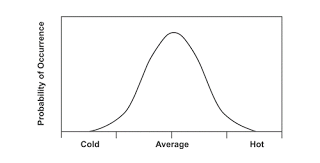
This indicator uses two data point measurements. which when combined measure the change in hot and cold extremes as climates changes in studied cities. Lessened cold extremes allow invasive species to gain a foothold. Extreme hot weather places stress on urban fauna and wildlife. Plus they cause peak demand on utilities for air conditioning. Cold temperatures are weighted at 35% while hot temperatures are weighted at 65%. Milder is better
Climate Susceptibility:
We use the seasonal score components of the Actuaries Climate Index™ which is a statistical score for climate change anomalies. It looks at Temperature, Precipitation, Drought, Wind, and Sea-level. In order to reflect the full impact of climate we sum the components rather than use the ACI's mean scores.
sum (T90std + |T10std| + Pstd + Dstd + Wstd + Sstd) Lower is better
Parkland Area Percentage: - Revised
Parkland connects us to nature and helps build ecological empathy. Parks are also habitats for nature, so the more park space a city has, the more eco-friendly it is. Higher area is better
Parkland connects us to nature and helps build ecological empathy. Parks are also habitats for nature, so the more park space a city has, the more eco-friendly it is. Higher area is better
Park Count:
More parks mean greater residential accessibility. The closer the proximity to parks, the more likely people are to walk in them and experience nature. More importantly, they can become wildlife corridors for insects, birds, etc... Higher is better
More parks mean greater residential accessibility. The closer the proximity to parks, the more likely people are to walk in them and experience nature. More importantly, they can become wildlife corridors for insects, birds, etc... Higher is better
Wilderness Area Percentage: - Revised
This is what nature is all about! Ecological empathy is cultivated when we regularly visit nature reserves and experience the wildlife and fauna. Higher is better
This is what nature is all about! Ecological empathy is cultivated when we regularly visit nature reserves and experience the wildlife and fauna. Higher is better
Biological Temperate Zone:
It uses the Plant Hardiness Index of each city. The higher the number the more biologically friendly the year-round climate is. Higher is better
It uses the Plant Hardiness Index of each city. The higher the number the more biologically friendly the year-round climate is. Higher is better
Data Completeness:
The total number of indicators data points collected including unreleased indicator data points. When cities measure and track things, they become visible and gain value which can be included in planning decisions.
Higher is better
The total number of indicators data points collected including unreleased indicator data points. When cities measure and track things, they become visible and gain value which can be included in planning decisions.
Higher is better
Data Freshness: - Revised
It measures how current the data is. This is accomplished by counting the number of indicators that are up to date. Higher is better
It measures how current the data is. This is accomplished by counting the number of indicators that are up to date. Higher is better
Indicator Equations
Formulas are further refined in each city's detailed spreadsheet
Click Scoreboard then city name then download: Spreadsheet
Formulas are further refined in each city's detailed spreadsheet
Click Scoreboard then city name then download: Spreadsheet
| City Size Categories Population Impact Municipal Area Population Density Population Growth Pressure (Revised) Green Transport Usage Driving Distance For Solo Commutes (Revised) Workforce Commuting Outside City Housing Demographics Air Pollution Emissions Solid Waste Tonnage Recycling Tonnage Organic Waste Tonnage Domestic Water Usage GHG Emissions (Revised) Clean Electrical Capacity Green Initiatives On Website Temperature Extremes Winter Temperature Extremes Summer Climate Susceptibility (Revised) Parkland Area Percentage Park Count (Revised) Wilderness Area Percentage Biological Temperate Zone Data Completeness (Revised) Data Freshness FINAL SCORE | Determines which max/min parameters data normalization uses Score = 1 - Normalized Population Score = 1 - Normalized Area Score = Normalized(Pop. / (Municipal Area - Greenspace Area)) Score = Normalized Percentage Growth, if < 0 use 0 Score = Sum of Percentage Use (Transits, Cycling, Walking) Score = 1 - Normalized Median Driving Distance Score = 1 - Normalized(Population x Percentage) Score = 1 - Normalized sum of (Structure Percentile x Weighting) Score = 1 - Normalized(sum of Air Pollutants) Score = 1 - Normalized Garbage Tonnage Score = Normalized Percentage of Garbage Recycled Score = Normalized Curbside Compost Tonnage Score = 1 - Normalized Water Usage Score = 1 - Normalized City GHG Score = Clean Capacity / Total Capacity Score = 1 for a clear landing page, Otherwise Score = 0 Score = | Normalized (Winter Min Monthly Avg) | x 35% Score = 1 - | Normalized (Summer Max Monthly Avg) | x 35% Score = 1 - Normalized (Actuaries Climate Index) Score = Normalized ((Sum of Parkland Area) / City Area) Score = Normalized (Park Count) Score = Normalized ((Sum of Wilderness Area) / City Area) Score = (Plant Hardiness Index) / 100 Score = (Indicator Count - Missing Data Points) / 10 Score = Count (up to data Data-Points) / 10 Score = (Sum of Indicator Scores) x 10 |
 RSS Feed